
Overview
Description
In efforts to incorporate AI in the modern market, Jenni helps SEO agencies boost their rankings on search engines, like Google. Although the technology is there, our clients requested that ideally, a dashboard would help facilitate the process of ordering monthly articles based on word count, keywords, and competitive links.
Softwares
Photoshop
Illustrator
Figma
Excel
CrazyEgg
My Role
My role in this startup was to design the landing pages, dashboards, graphics, and do UX evaluation during each stage of parallel designing. For this project, I designed a section called order a new article, while Justin worked on creating a section for clients to check up the articles' status.
Skills
UX Research
Design System
User Interviewing
Branding
Prototyping
Wireframing
A/B Testing
Team
UX/UI Designers:
-
Rebecca Hsiao
-
Justin Lee
Software Engineers:
-
Henry Mao
-
Luo Yi Dong (Roy)
Applied Scientist:
-
Taylor Shin
Date + Location
July 2019 - Now
UCSD The Basement- Converge Incubator
Design process

Problem statement
A huge market opportunity presents itself in the industry of SEO with the help of AI to produce higher quality, affordable, and consistent content. Lack thereof such platform, we created a dashboard to facilitate the process of ordering content (articles).
pain points
Secondary Research:
Experiment Goal:
Target Users:
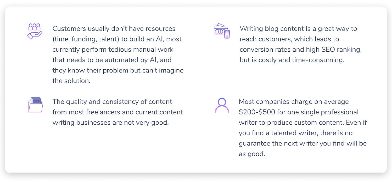
While large companies like Google and Facebook are able to afford AI specialists, most of these small companies just don’t have the resources to do so. Every year, around 100,000 tech startups get funding. However, many of these startups need assistance in incorporating automation to solve their problems.
Research shows that $79.3B is spent on SEO in 2018, of which $40B is spent creating or buying content to rank. This proves that there is a huge market opportunity in building the next AI platform that can accelerate the creation of written content for SEO agencies.
Market Competition:
Lack of AI tech in SEO:

User Research
Much like Uber's drivers and riders, Jenni is a service that utilizes a dual-brand strategy, where customers are SEO consultants that help boost SEO rankings, while writers provide one essential portion of the service—content writing—to them.
In order to make a well-rounded dashboard, we first needed to discover our potential clients' pain points. Therefore, we created a list of our hypotheses we thought SEO agencies wanted vs. doing primary research to find what they really wanted.
-
Writing blogs are difficult, and require research
-
Keeping a writer on payroll is expensive
-
SEO agencies want a cheaper and faster alternative
-
SEO agencies care about quality and want to have the entire article be generated
What we thought our clients wanted:
Client Interview Process
Having an opportunity to automate content writing in the SEO world, we wanted to start off by interviewing 50+ SEO agencies nationwide. We conducted a 15-minute phone interview to understand better the problems they were facing by stating:
"We want to help SEO consultants lower their costs while generating more high-quality content. In order to do so, we would love to do a 15-minute interview to understand your needs and pain points so we can build the best possible product."
What we actually learned:
These were the 4 most trendy insights towards the features of what the majority of SEO agencies are looking for:
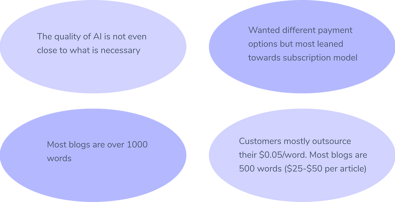
In addition to these insights, the 4 most common problems we found were:
User persona
The following persona describes a client, the CEO of an SEO agency, who is looking for a dashboard system to easily request and receive articles for their clients.

Competitive audit
Comparing Jenni with Other Services:

Our goal was to create a platform that would differentiate itself from other content writing agencies. We planned on integrating human writing with AI tools. The following diagram shows the competition of markets in content creation for SEO in 2019. While both Textbroker and Freelancer both fall short, Jenni is supposed to provide ease-of-use & high-quality content to clients. The following design space and graphic depict where Jenni stands in comparison to its competitors:


Storyboarding
After consolidating the data from primary and secondary research, we created a storyboard to solidify SEO consultants’ core motivations and frustrations when receiving content. We believe that the following storyboard reflects our problem statement because we are striving to help SEO consultants lower their costs while generating more high-quality content.
Suppose Jason is running an SEO agency and needs to find a content writer for one of his clients. He checks freelancers in the related field and hires someone expensive, only to receive badly written content. With Jenni, his business can produce content of high quality, affordability, and consistency.

Lo-fi Prototyping
Creating a Client Dashboard
-
“How might we facilitate the act of requesting orders?”
-> Make the main feature on the homepage a box where clients can type in the title/ topic of the article
-
“How might we make sure that we take into the account word count?”
-> Add a word count box next to the box for the topic.
-
“How might we help clients visualize the orders they requested?”
-> Right under Define Article Topic Add, show a list of requested articles.
Original Design
Order New Article
Status of Articles


Alternate Entry of Exploration
-
“How might we present the number of words clients have for a specific month in a visually engaging way?”
-> Add a words count progress bar that upon hover, shows the number of words left for that month. It's more visually appealing than if only the word count was displayed
-
“How might we ensure all article descriptions are conveyed to us?”
-> Add a word count box next to the box for the desired topic.
-
“How might we help clients visualize the orders they requested & received?”
-> Have a separate section showing a list of articles requested & received
Alternate Design
Order New Article

Status of Articles

Hi-Fi protoyping
For our mid-fid prototype, we chose to move forward with Iteration B due to the insights we received and transformed it into a hi-fi prototype. They helped us visualize the direction we were heading in a more clear way. Then we showed 3 of our clients the wireframe of the dashboard and was able to get invaluable feedback.
Drawing color inspiration from Medium Muzli to experiment my creative endeavors, I made sure to create a dashboard that would not only look aesthetically techy, but be easy to use.
After logging in, our clients are directed to their personal dashboard, space where they can define the topic they want our AI to generate, the word count desired, and additional info.
Order New Article
Before

After

Status of Articles
Before

After

Feedback from Clients
-
User A: "I wish to see more transparency, that is, to be able to track in between each stage of the article production so that I have a better idea when to receive my article, rather than just an Estimated Time of Delivery."
-> Created a visual chart that shows at which stage
-> 6 statuses: Pending, claimed, being written, delivered, received feedback, and finalized.
-
User B: "I've ordered 30 articles. Is there a way to use a filter option to see the completed articles?"
-> Sort by: A-Z or Z-A, Most recent order or Oldest order, and Status
Alternate Designs
These were the designs we discarded and chose not to move forward:
View All Articles- Image Files

Status of Articles- Timeline

Order Article- Simplistic

Status of Articles- Pie Chart

User testing
User Testing Protocol
2 rounds of iterative design of the homepage still had us receive complaints from our clients. It was important for us to make the dashboard experience one that clients would enjoy using, so we parallel A/B tested 2 aspects:
-
Dashboard Homepage- Submit an article
-
View each stage of the article under Order Status
Order New Article
Iteration B
Iteration A


The left one is a more simplistic design, with less customizability, but more straightforward to use. The right one has more SEO-specific terminology, such as competitor links, keyword, and keyword variations, but more steps to fill out.
Transparency to Customer
AI can raise a lot of skepticism, especially since our customer demographic is middle-aged men. Therefore, creating more transparency between each stage until delivery is very important as a gateway to developing mutual trust. View at each stage how many articles are pending, claimed, being written, delivered, received feedback, and finalized.
Status of Articles
Iteration D
Pie Chart
Iteration C
Horizontal Bar Graph


View at each stage how many articles are pending, claimed, being written, delivered, received feedback, and finalized.
Parallel A/B Testing- Dashboard Homepage & Order Status:
Begin Testing
-
Group 1: Suppose you want to request one article called "What is an SEO Company?", with 1,000 words, XXX competitor link, and XXX keywords.
-
How intuitive is it to use?
-
What is the purpose of having keyword variations?
-
-
Group 2: Now you would like to see where you can track the order you just requested.
-
What do you understand from the graph?
-
Can you only locate the articles that are pending?
-
Which of the two graphs was easier to read at a glance?
-
Do the statuses make sense to you? If not, why?
-
Do you feel strongly about either of the graphs and if so, why?
-
What do you need from a summary of your orders for the month?
-
Recording of User Interaction:

UserA interacting with Iteration A of ordering a new article
User Insights & Statistics
Using the within-group research method, we found out that:
-
out of 6 users, the average preferred Iteration C, the bar graph, to visualize their order summary
- the level of satisfaction for the bar graph was higher
- the average time of completion of tasks was also lower compared to the pie chart
User Y: "Shows changes across time better than pie, if we need it to"
User X: "Accurately displays information in a responsive and scalable manner relevant to the webpage"
Iteration F- Pie Chart
Iteration E- Horizontal Bar Graph

3/6 preferred Iteration B- Homepage with more SEO-specific terms but gave some constructive feedback:
User O: When pressing Add Link button, this screen was not what was expected but like it better.
User P: When the user tried to add a duplicate competitor link, the error message threw him off because it came off as aggressive.

In the think-aloud experiment, where we asked users to interact with the Figma prototype, they shared some insightful thoughts, where we annotated on Google Spreadsheet.
A/B Testing Results—Iterations B & C:
After understanding users' preference over the homepage interactive experience and the display graph for order status, we decided to move on with Iteration B and Iteration C.


conclusion
We have now acquired and retained a total of 10 recurring clients who are SEO consultants. Despite the short-term success, a lot of A/B Testing should still take place in order for us to locate exactly the modification that our clients prefer. During this project, my team and I pivoted to so many different areas and directions, which resulted in design challenges that we did not foresee. I revisited the problems and realized that because we are such a small team, we can only tackle one problem at a time. As a designer, I saw that no one solution hit the mark perfectly, but believing in the results from A/B testing and making a decision accordingly is what is so promising for this start-up.
