Hi there I craft GenUX experiences in
Produced 200+ editorial image assets on font readability and underserved languages across Material Design and Google Design websites, reaching over ~500K page views.
Rebecca Hsiao
Senior Product Designer
Google · San Francisco, CA
Google · Sunnyvale, CA
Jenni AI · San Diego, CA
B.S. Human-Computer Interaction Design · B.A. International Business
Always up for talking type, GenUX, or what a portfolio should be able to answer on its own.

An AI automated project
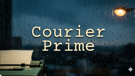
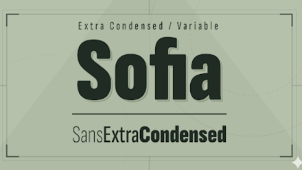
A poster for nearly 2,000 font families, each showing the font’s personality at a glance, generated with no human in the loop. I spearheaded our first GenUX effort, from the demo that proved it was possible to the creative bar that let it run on its own.
A multi-step framework where Gemini knows the end goal, text and background that co-exist, and a feedback loop that assesses and improves every poster before it ships.
* We are among the first teams to successfully achieve a fully automated pipeline
A year of work and 20+ iterations, from the Imagen image model all the way to Gemini 3.1 Pro.
I explored the first direction and built a demo infrastructure with AI that generated 50 font posters, showing it was possible.
Engineering took over to scale it. Scaling was hard: we kept hitting an 85% success rate.
I helped the pipeline reach the creative bar set for our qualitative metrics. I knew when it wasn’t good enough, and pushed until it was.
Receives font metadata
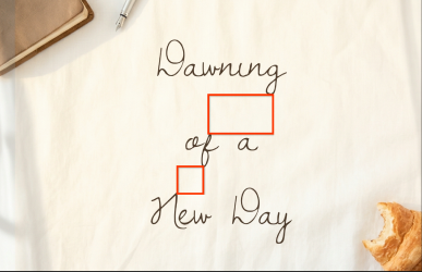
“A sun-drenched linen bedsheet with a small, leather-bound journal resting open. A silver fountain pen lies next to a half-eaten croissant, with bright morning light streaming through sheer white curtains…”
“Dawning of a New Day is a monolinear, extremely thin cursive script…”


If rejected, it enters this loop again


Text is the star of the show. The background is there to carry the font’s vibe and one potential intended use.
Busy backgrounds made the text unreadable.
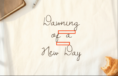
DecisionGemini wasn’t strong enough to typeset on its own, so we built our own line height and font size algorithms that detect issues and auto-adjust, plus a color contrast tool (below).
Image blending wasn’t strong enough; the model hallucinated the text.
DecisionRender every word in HTML + CSS, so the type is always the real font, set exactly as designed.
Art styles kept repeating from poster to poster.
DecisionComposition layouts for where the subject sits, plus the metadata tags from my earlier filter tag project, so the model understood each font’s vibe and mood.
Scaling stalled at an 85% success rate.
DecisionA feedback loop with self-improvement assessments. This was the turning point to 100% with no human in the loop.
Gemini hallucinates color, so it couldn’t be trusted to judge whether its own text was readable.
Decision · I created a color contrast toolIt measures the poster as rendered, not as described.
If more than 90% of the pixels pass, the poster passes. If not, it’s rejected.
Gemini had no spatial awareness. It rendered the HTML text outside the main frame, or overlapped text on text.
Before, it generated the HTML first and then swapped the HTML background for a Nanobanana image, which caused awful color contrast and ignored where the text sat.
Decision · a multi-step frameworkGemini knows the end goal from the start: the text and the background have to co-exist.
Gemini first runs a font analysis and reads metadata tags like sophisticated, so every prompt has the context it needs.
Before · 3 slots
[subject] doing [action] in [art style]
Wasn’t good enough
After · 8 slots
“Gemini drives the creativity, while our algorithms enforce the quality.”

“Gives me an example and a foresight as to how I could use the font”

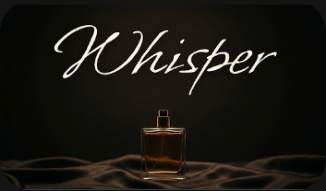
“It pairs beautifully with a dark perfume image. It just creates like a premium and sophisticated mood”

“For me it’s very, very important that the background and styling actually has to match with the personality”
Learn what Gemini is bad at, and create algorithms that act better than Gemini alone.
Questions we asked ourselves:

Community building through
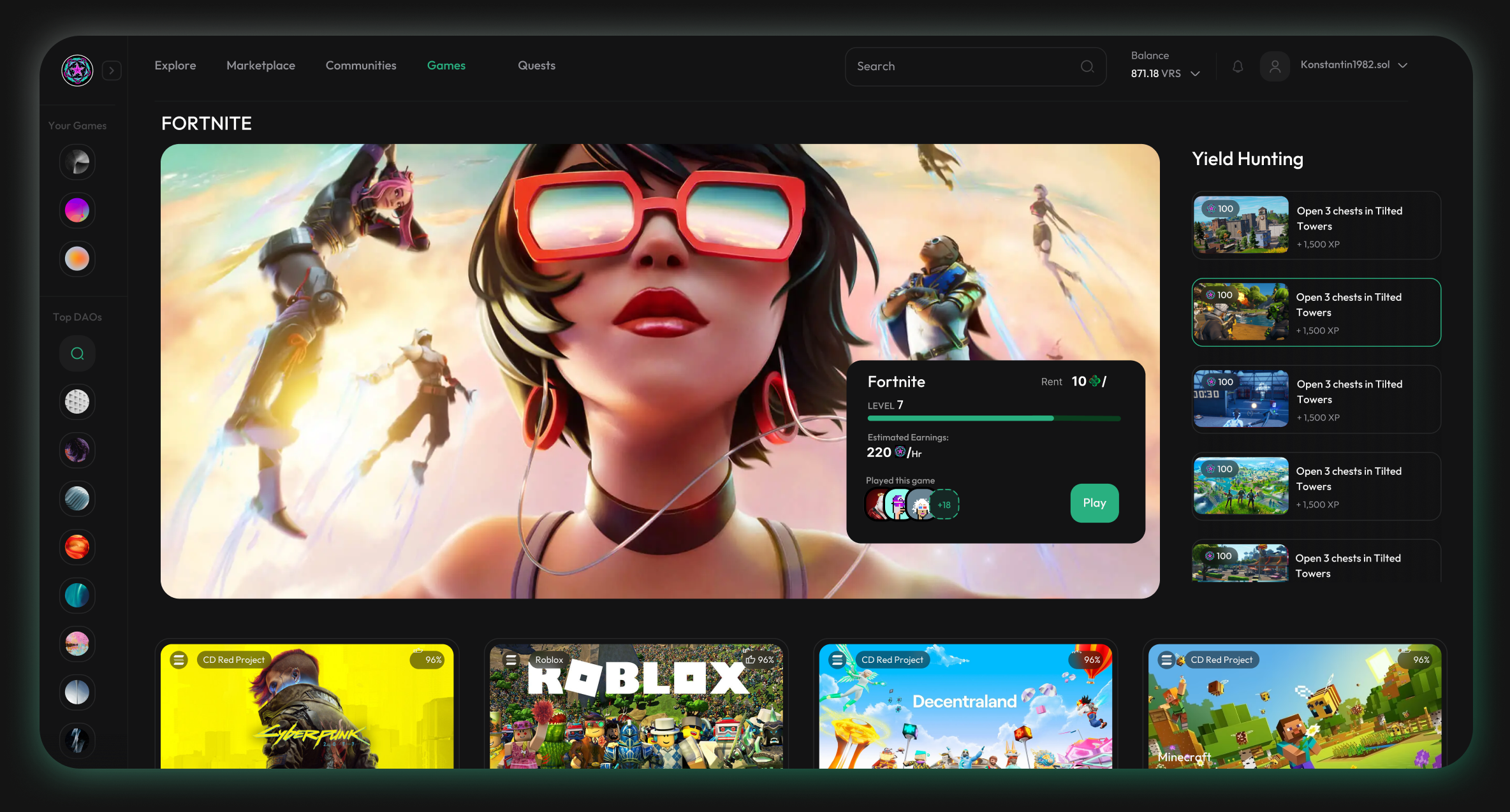
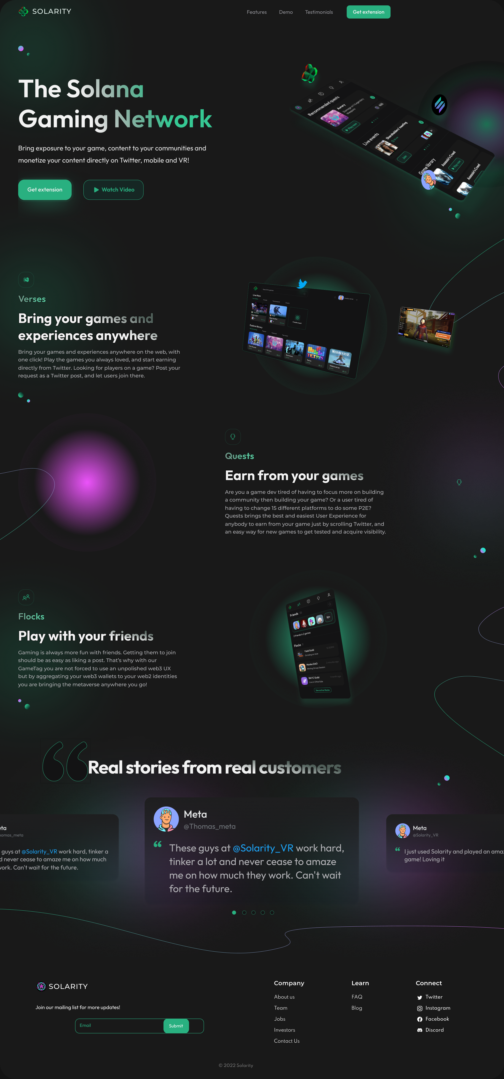
Bring exposure to your game, content to your communities, and monetize it directly — on Twitter, on mobile and in VR.

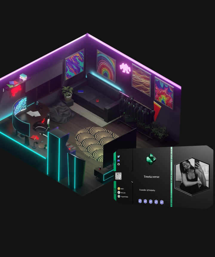
Isometric spaces a community owns and gathers in, with its own screens, art and seating.
Choosing who you are before you join — the same identity carries across mobile and VR.

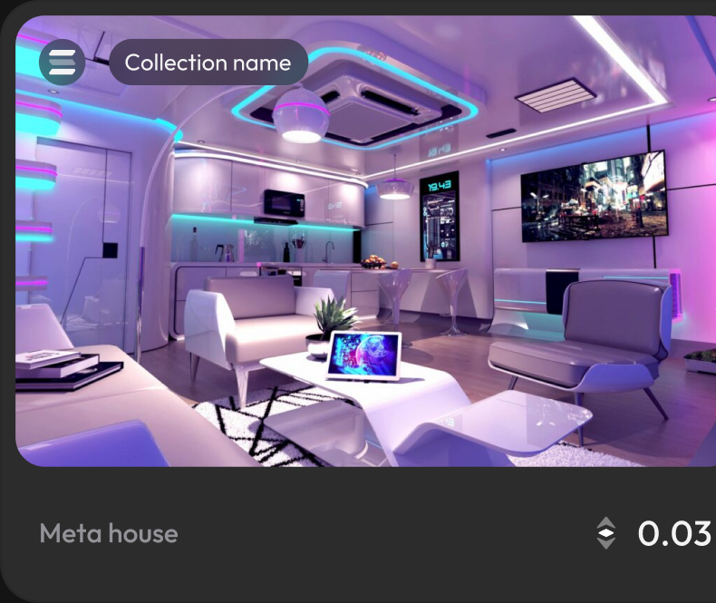
Rooms listed like collectibles, with price, owner and live occupancy on the card.


Co-founder and sole designer
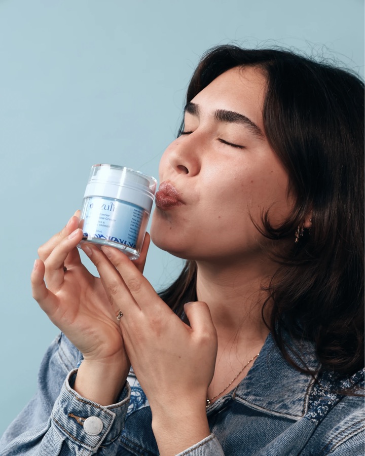
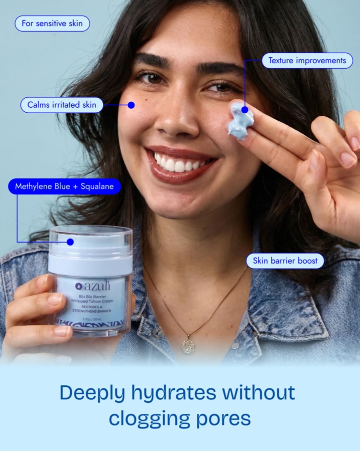
A skincare brand built from nothing. I co-founded Azuli and designed every piece of it — the logo, type and color system, the jars and boxes, the product photography, the social content and a custom-coded Shopify store.

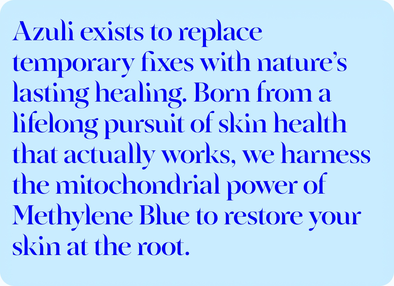
The mission, from the brand manual I created. Methylene blue is the hero ingredient, so it sets both the story and the color.

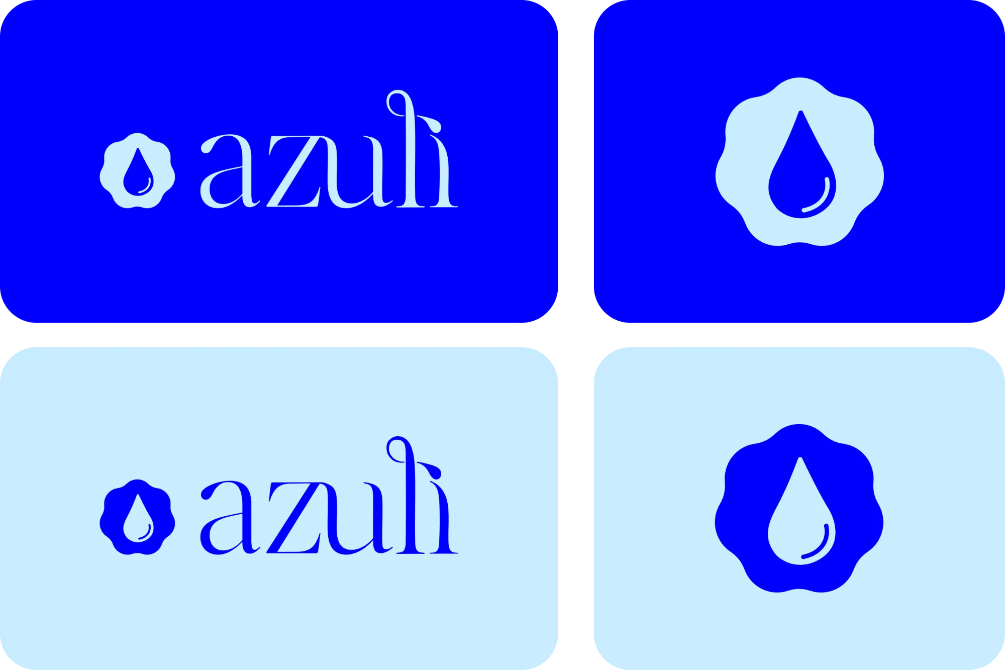
A water-drop mark with a lowercase wordmark, in dark and light mode lockups.
The main palette, for the brand and Blu Blu Barrier
Digital · web and social#C9EDFF201, 237, 255#0000FF0, 0, 255#000F9F0, 15, 15916.55, 1.82, 1.97, 0100, 80, 0, 0100, 87, 30, 18The print palette is also the reference for product photography, so shots and screens stay in the same blue.
The second palette, for Golden Hour Glow-Up
Digital · web and social#F6E5B3#F36F32243, 111, 50#DD4D0A221, 77, 103.52, 7.42, 33.98, 00, 70.7, 90.37, 09, 84, 100, 1Used for print, and on screen wherever Golden Hour Glow-Up appears.

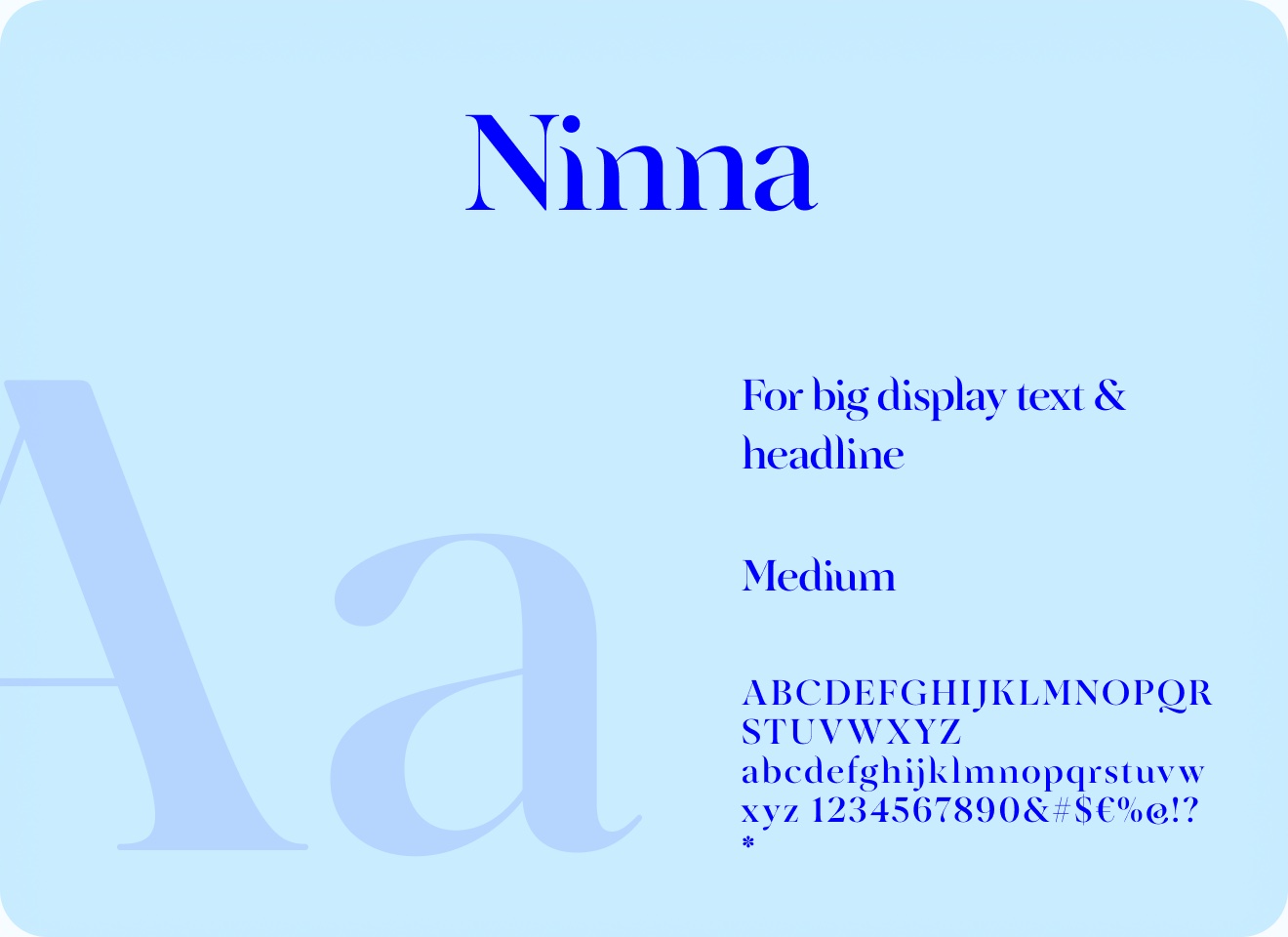
The main font, in medium, for big displays and headlines. The Azuli logo carries traces of it. High contrast, serif, elegant, sophisticated.

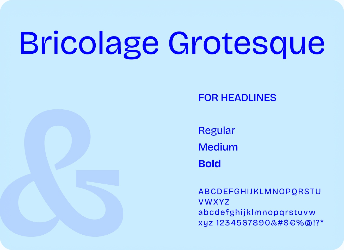
A display font for smaller headlines and titles. More readable than Ninna, so it carries educational video captions and posts.

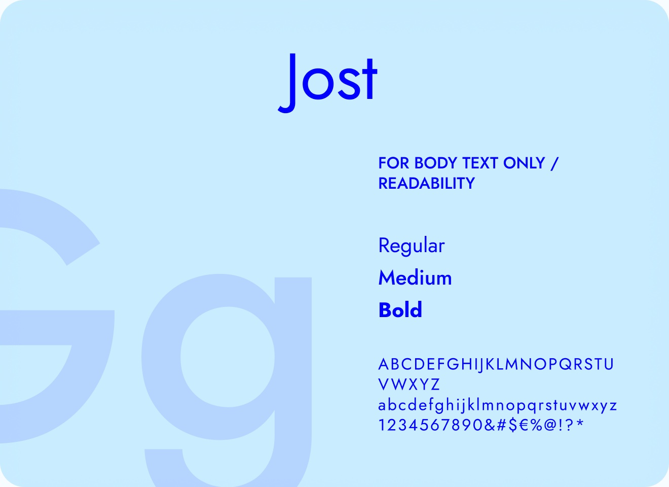
Small body text, for legibility and readability. It also sets the descriptions on the jar labels.
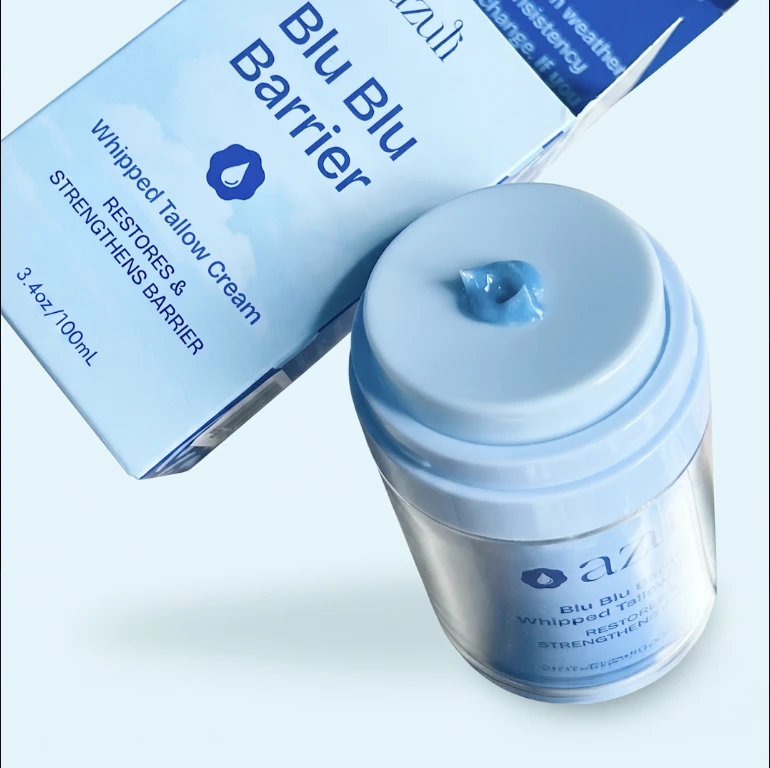
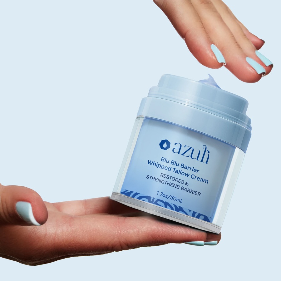
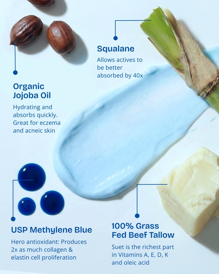
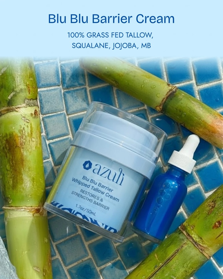
Whipped tallow cream with methylene blue and squalane, made to restore the skin barrier. Dressed in Azuli Blue.
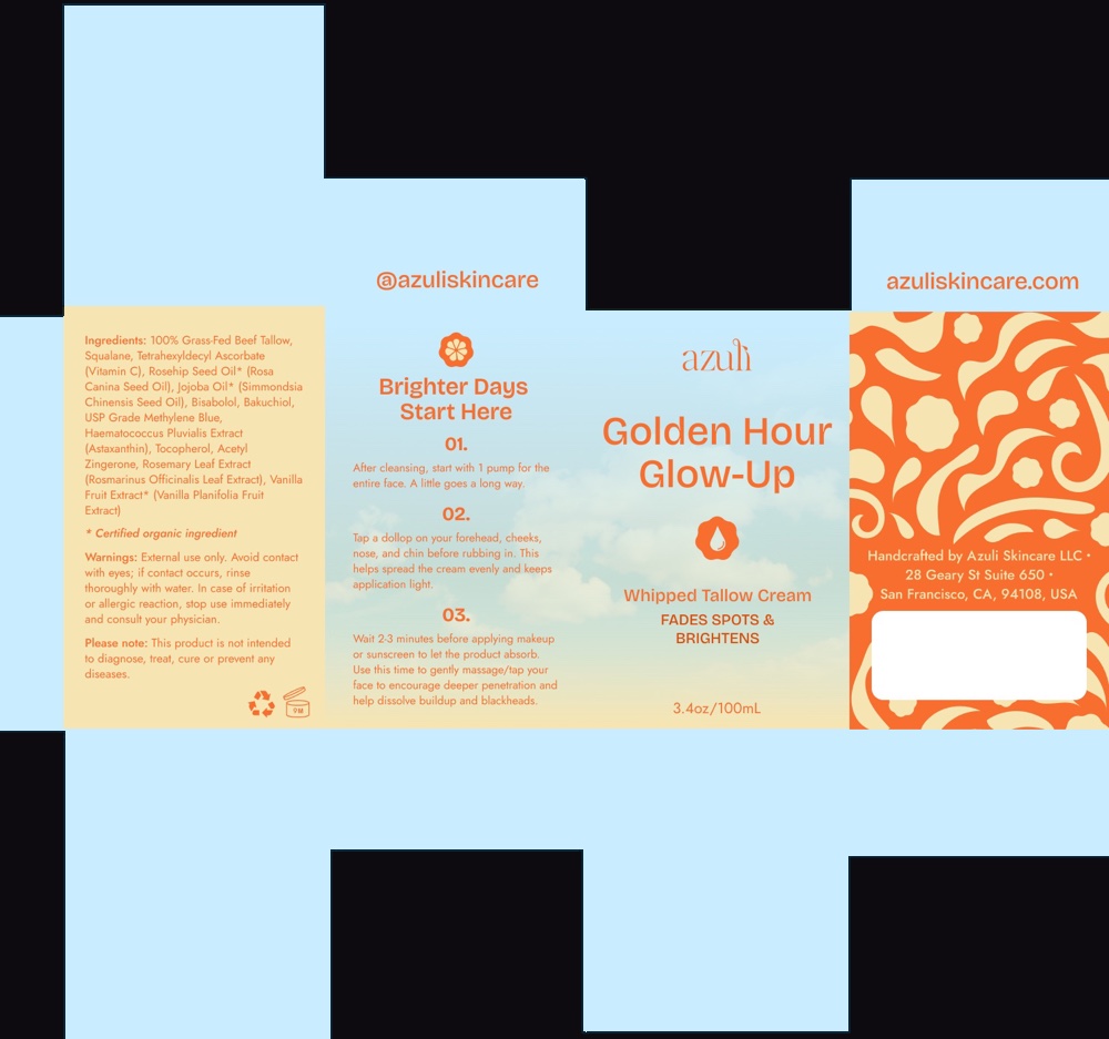
Whipped tallow cream with vitamin C, bakuchiol and astaxanthin, made for brightening. Dressed in Golden Orange.


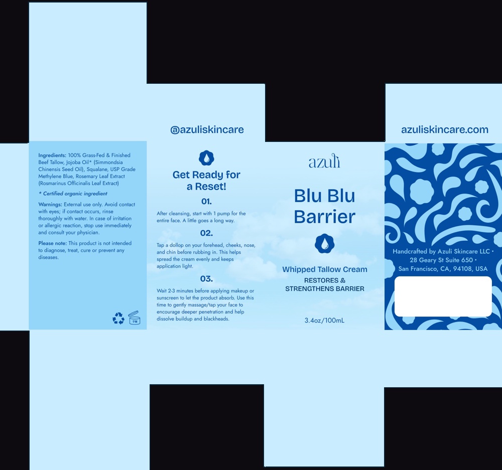
I designed the jars, the boxes and every printed panel — ingredients, three-step directions and the pattern that wraps each box.
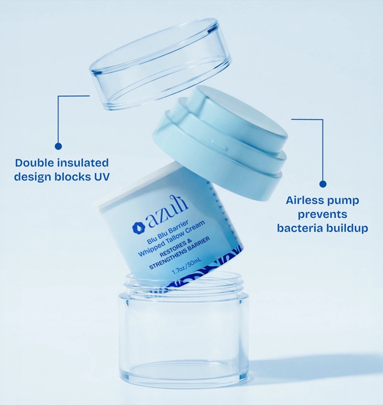
Azuli is the first tallow brand to use this jar design. I chose it to keep the cream clean, fresh and dosed right.

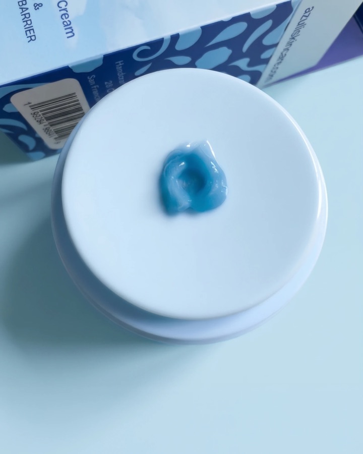
The pump keeps bacteria from getting in, so the cream stays clean.

Each press dispenses the correct amount, every time.

A jar within a jar keeps the ingredients fresh for longer and blocks UV. The pump and inner jar are 100% recyclable.
Ingredient, skincare-step and benefit icons in outlined and filled styles, built on Google's Material Symbols so they sit naturally in the storefront.


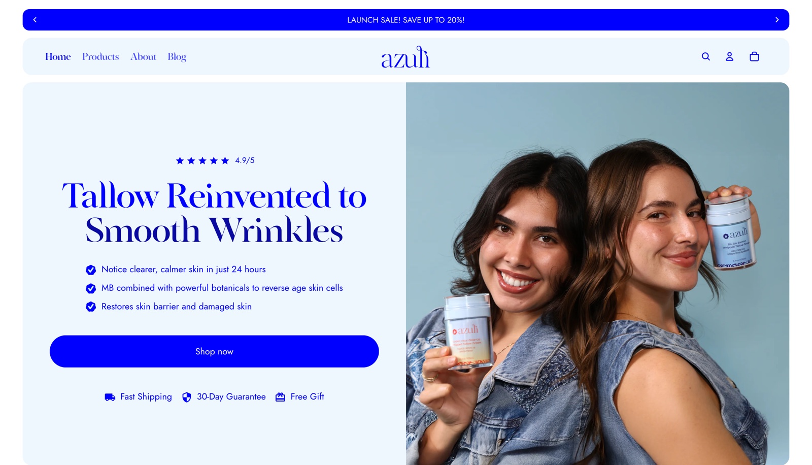
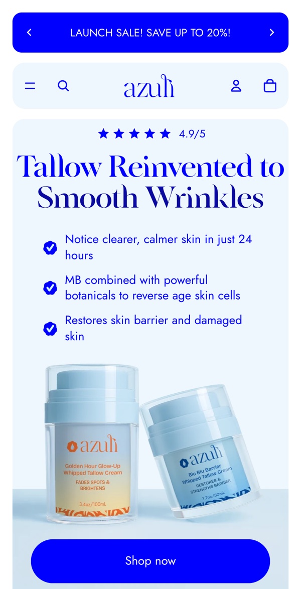
Rather than start from a template, I designed the whole store in Shopify and customized it with Shopify's native theme code. Azuli has just launched, so the store is where the brand system meets real customers.