
Overview
For this project, my team and I worked on the end-to-end iterative process of defining, testing, designing, and developing a mobile-friendly app. To serve the theme of Breaking Barriers to Learning, we created NotesCast, an app for college students aiming to provide note-adding interactive features on video podcasts.
Softwares
Sublime Text
Figma
Google Analytics
My Role
Primarily, I worked on leading the UX work. I designed the interface, contributed to the product discovery, and helped with user testing. My design choices inspired the entire look & feel of the app, from its color, typography, and user flow.
Skills
Nielson's Heuristic Evaluations Feedback
Storyboarding
UI
User Experience Prototyping
Wireframing
Usability A/B Testing
Team
1 UX/UI Designer:
-
Rebecca Hsiao
2 Software Developers:
-
Manxue Li
-
Yuan Hao Zhu
Date + Location
10 weeks
UCSD
Problem Statement
University podcasts should be a great resource for learning but they do not optimize users’ memory retention to full capacity due to their lack of interactiveness and note-taking capabilities.
How might we aid college students to most efficiently capture the main points from lessons with the technology we have at hand?
Interview process
In our design process, we conducted need-finding experiments to better understand the problem and our audience, and make step by-step-observations.
"Don't listen to users. Pay attention to what they do, not what they say."
—Nielson Norman Group
We started by conducting two experience prototypes with 12 random UCSD students, where we simulated the experience of using the app that we would be creating to analyze different user needs. They interacted with the existing UCSD podcast website. During this process, more than observing user behaviors when interacting with the mock app, we also asked 10 open-ended, nonleading questions, such as:
-
How do you take notes while listening or watching this podcast?
-
How do you review or study for an exam?
-
Tell me about the biggest obstacle that prevents you from sitting through an entire podcast. What made it an obstacle?

Vanilla bounces between the lectures and Notes app. Since the screen is too small, she barely can see the text and picture and relies mainly on the audio.

Strawberry only has audio-centered podcasts for her BENG class. Although she has the lecture slide on the side, tracking learning and and taking notes are still very difficult.

Chocolate entered the full-screen mode but could not take notes on Google Doc anymore.
Research rESULTS

High cognitive load
All users struggled to find the part of the podcast where they left off after leaving for a while and coming back to it, resulting in wasted time from frantically skipping.
If the system could automatically remember where I stopped, I would spend more time studying the content.
—Cinnamon


The need of additional resources
All users requested/or pulled out a separate note-taking medium (Word, Google Doc, Apple Notes, notebook).

I wish I could watch this lecture without interruptions. The way it is set up now when I exit to open [Apple] Notes, the audio & video stop playing. It's really tiring to constantly navigate between these two apps."
—Vanilla

Faster yet effective
6/12 users sped up the playback speed to at least 1.2x faster.

I won't watch the entire lecture because it's 1h33min long. Since there's no way of skimming, speeding it through is key.
—Basil

GOALS to Tackle Main User Needs:
-
Reduce the cognitive load of finding specific parts
-
Take notes easily while watching the podcast
-
Know the content based on timestamp/ preview of thumbnail
-
Maintain attention over an hour-long podcast
-
Actively engage
competitive audit using 8 learning apps as reference
Crossing off important functionalities of some of the most successful learning apps, we had a better visualization of the app we wanted to create. We felt that these video-centered apps that have added interactiveness (playback spee and add comment feature) are useful for learning and would give us more insights for developing a mobile podcast app.

Functionality Inspirations:
Collecting information about what the user needed from the UCSD podcast website made us understand that the type of functionalities they valued. For our app, we decided to take functionalities from the following platforms:


University podcast platform that automatically uploads daily lectures.
-> Recorded in-class lectures and upload them as videos. We made sure that the videos are organized by courses/ dates/ weeks


Has a high degree of freedom to upload and comment but can be distracting as it will suggest irrelevant videos and will pop up ads
-> Added playback speed function
-> Instead of comments, we added "add notes" feature


Listen to music or podcast on the go, but offers no video and little to no interactiveness
-> Listed each podcast, one beneath the other, which allows for vertical scrolling


Editor to write texts and add images with little to no video-centric features
-> Added comments/side-notes to a specific part of a text.
User personas
To gain a better understanding of our target users, I chose 2 college students with different studying habits and lifestyles, who would like to revisit material that they might have missed during in-class lectures.


removing barriers to learning
To summarize our need-finding and personalize a situational occasion of our users interacting with an existing podcast apps in the market, we created 3 storyboards but delivered 1, as seen below:

Upon reviewing for her upcoming math exam, Linda forgets at what point in the lecture she last stopped and which section needs additional review.
Low-fidelity iterations
vs.


Based on the competitive audit research and feedback we received from other teams, we created 2 designs, a audio-centric podcast vs. a video-centric low fidelity prototype. This would reduce the overhead costs when redesigning for high fidelity prototypes.
In our paper prototypes, we visualized our app in usage. Its basic functionalities and simplest layout were ready to be critiqued by other teams.
Paper Prototype #2
Paper Prototype #1
Audio-centric design
Video-centric design


Demo Prototype (1 min 27 sec)
In the critique sessions, 2 groups used Nielson's 10 Heuristic Evaluations to give our app qualitative feedback. THe 2 main problems with our paper prototypes were #3 and #9:


User Control and Freedom
-
Professors present many theoretical concepts that are difficult to fully explain without visuals, so audio-based podcasts would not be ideal.
-
When on the podcast note page, there seems to be no way to go back to the original podcast
the page where you can write your notes.
Helping Users Recognize, Diagnose, and Recover from Errors
-
Having the functionality to delete notes and remove timestamps would be extremely beneficial in both
prototypes in case the user accidentally creates a note or timestamp. Another cool feature to add would be the
ability to adjust the timestamp after the note was already saved.
In the end, we opted for a video-centric podcast system, added a back button to every page, and added delete notes & timestamp function. Before moving to a high fidelity prototype, we needed to A/B test first.
Wireframing
On a medium-fidelity prototype that was created on Figma, we had users interact with the screens.

The main functionality of our app is Adding Notes, which is formatted as a bar and can be seen beneath the video. Once a note is added, it can be found instantaneously under Note History. By tapping on the note itself or the time-stamp, the video automatically skips to the part where the note was added.
Alternate designs
For Design A, we originally thought of adding a Recently Viewed under courses in case users forget the last lectures they visited. However, our TA suggested that because it requires scrolling to see this, a lot of users might not even notice the existence of it. For Design B, we decided to place it as a separate tab on the same level as Courses.
Hypothesis: Given that we add a Recently Viewed tab next to Courses, then people should notice is quicker and click on it more.
Design B - Variant
Design A - Original

Requires scrolling to see "Recently Viewed"

Added color and font-size
Added this tab to test whether visibility increases

User testing
We recruited 3 UCSD students, females and males, aged 18-21 to test out our app on-site. Because most of them have had prior experience with the UCSD Podcast system before and are a good representation of our target demographic (college students), this sample would be a good prediction of the population.

User A realized that upon adding a note, the video becomes black and it starts over.

User B had trouble signing up due to a bug.

User C mistakenly clicked on a lecture but it directed her to another.
Tracking Clicks Using Google Analytics
To test the number of clicks, we had a total of 126 people interact with our app.


When comparing Designs A and B, Design B had 6 more clicks than Design A. This means that that variant design, with alteration with the Recently Viewed tab, had an overall higher number of clicks.
Sample Statistics

Table above shows the average clicks per user. Design B has one more click compared to Design A.

T-test Result
T is 0.7285 which is smaller than the critical value (0.7285 < 1.734). Therefore, the null hypothesis (no significant changes occurred) is true. No visible effect is probably due to the small sample size. Although the results showed insignificant outcome due to a small sample size, if we generated 1000 samples, then the outcome did become significant.

High fidelity Design
Despite the insignificant result due to the small sample size, my team decided to keep Design B, the variant because placing the tab called Recently Viewed next to Courses allows for more visibility, discoverability, and equal hierarchical level. This way, it better matches the user's mental model.
Open App
Login
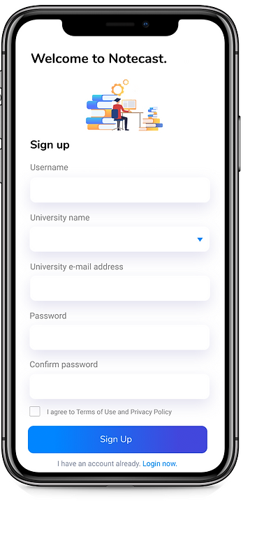
Sign Up
Course List


Lecture List
Recently Viewed lectures
Podcast with add note feature
Profile info in editing mode


Interact with the app!


Our Solution: Learning Made Easy
With the discovery of NotesCast, students have the ability to add note(s) that link to specific part(s). Later, when reviewing the material for an exam, users may simply click on the notes or timestamp previously added and be directed to that part of the podcast.

FInal Thoughts
What went well?
This could be the next thing in demand for university-level students.
From working with our team, I learned that a clear division of tasks assigned to each of the team members based on individual expertise is very important to team collaboration. Our team is formed with people of different expertise, some with an abundance of design experience and some with fluent programming skills. By collaborating, we are able to produce solutions that are both aesthetically pleasant and technically viable.
What were the challenges?
We also went through a time when duplicate works were done because of bad communication. Afterward, we ensured that we discussed each person's role and created a Development Plan on Excel for each week before we actually started to do something.

IF we had more time what we hoped to achieve
As we are college students ourselves, setting ourselves to a high academic standard and to learn efficiently, we developed this app. Although this podcast app only works for college-level courses, we hope that we can continue to use this iterative design process to hopefully help students take notes in a more efficient manner across all levels (elementary, high school, and university).
