Team
Softwares
Skills
Duration + Location
Google UI Design Kit
Figma
Photoshop
Miro
Invision
User Interface
User Research
Interviewing
Storyboarding
Wireframing
Prototyping
Rebecca Hsiao (Product)
Evan Lam (UX)
Hanley Yu (UX)
Marissa Valenzuela (UI)
10 weeks
ZOOM
OVERVIEW
OVERVIEW
2020 is not cancelled
ShopCheck is an easy-to-navigate app designed to help everyday shoppers find grocery stores nearby and see their fullness in order to avoid big crowds. During this pandemic, grocery stores are experiencing bottlenecks due to the inability to carry out strict safety regulations without having their business affected. To solve both business & safety issues, I introduce ShopCheck. With a built-in check-in system and data transparency, stakeholders—customers and frontline food workers— are safely in check.


What are Essential workers saying?
"
I can wear gloves but I'll be concerned in changing my gloves consistently in order to keep the next customer safe."
— A worker at McDonald's
"
I think everyone that has to work during this crisis — medical, retail, and fast food industry — should get paid more for putting their families at risk. Why is this not something that is going into effect?”
— Ryan from Dunkin' Donuts
CLICK ANYWHERE ON THE SLIDESHOW TO STOP ROTATION
PRIMARY RESEARCH
Our SurVEY GETS ATTENTION on reddit
Target audience: Essential food workers, who
are highly exposed to face-to-face interactions
with customers
Goal: Creating a first-person perspective and
quantifying how safe or unsafe grocery shops are
currently


Affinity Map:
I revisited all of the most common and trendy survey's short-answer responses and grouped them into three categories using Miro.

After creating our survey on Google Forms, we posted it on Reddit and had immediate response. Within the 41 responses, 4 people showed interest to pursue further one-on-one video chat interview.
INTERVIEW
Insightful CONVERsATIONS with 4 workers
After our survey, we received 6 follow-up
e-mails from participants that were willing to
kindly share their own experiences. We used this
opportunity to deeper dive into firsthand
descriptions of what life was like for
food-service workers during the pandemic. For
safety reasons, we scheduled and conducted all
of our interviews over Zoom.
We interviewed 4 workers involved in grocery
store and food-service work, ranging from
students to managers. Our interview method was a
Diary Study format, where we asked them to share
what their day at work looked like. We made sure
not to ask any leading questions, and we gave
our interviewees a lot of space to think and
respond.

Evan interviews Mark Pemble, a general clerk at Albertsons
3 main struggles that essential workers are facing:

PROBLEM SPACE
HOW MIGHT WE
How might we diminish physical interactions by motivating customers to shop safely and, as a result, protect frontline food service workers in their workplace?
To summarize the primary and secondary findings in a problem statement, we concluded that:
In this pandemic, grocery retail stores are facing a lack of a measurable way to impose safety & sanitation guidelines on customers, which is a risk to not only shoppers but grocery store employees, families, and anyone in close contact.

USER PERSONA
Who could be at risk?
To gain a better understanding of our target users, we chose 2 workers to share their safety needs:


IDEATION
BRAINSTORMING SOLUTIONS
With this problem statement in mind, we set forth brainstorming ideas. We speedy sketched 4 solutions, weighed the pros and cons, portrayed in form of storyboards and matrix.
Informative app on facemasks

People-counter app
Universal contactless payment
Health monitoring


1. An informative interactive educational platform with videos and tutorials
+ Using free resources to learn about different ways to protect themselves and others
+ DIY tutorials are easily to follow and can condition the mind through action
- Users might not be incentivized to learn
- Learning about protection does not equal action
2. An app with a check-in system that also shows the number of people inside a store
+ If customers can see how full the store is less, they can spread out and go shop during different times
+ Employees would control more efficiently the number of people inside, which would decrease the probability of contamination-spread
- Data and privacy concerns
- Limiting the number of people inside a store does not control social distancing
IDEATION
Impact Matrix

After studying the matrix, it became very evident that the people-counter app idea demanded the least amount of effort and the highest impact, while the other ideas already exist in the market and would produce too much competitiveness.
This idea stood out because a people-counter app could help reduce congestion and increase social distancing in a closed space. Shoppers could also know when to avoid peak hours, reducing the risk of shortages at grocery stores.
I created a storyboard to recreate the use of this app in action in the scenario:

COMPETITIVE AUDIT
CROSS-FUNCTIONality
We narrowed down to the following functionalities and analyzed them from 4 successful apps to compare it to ours.

LAYOUT
Sketching & wireframing


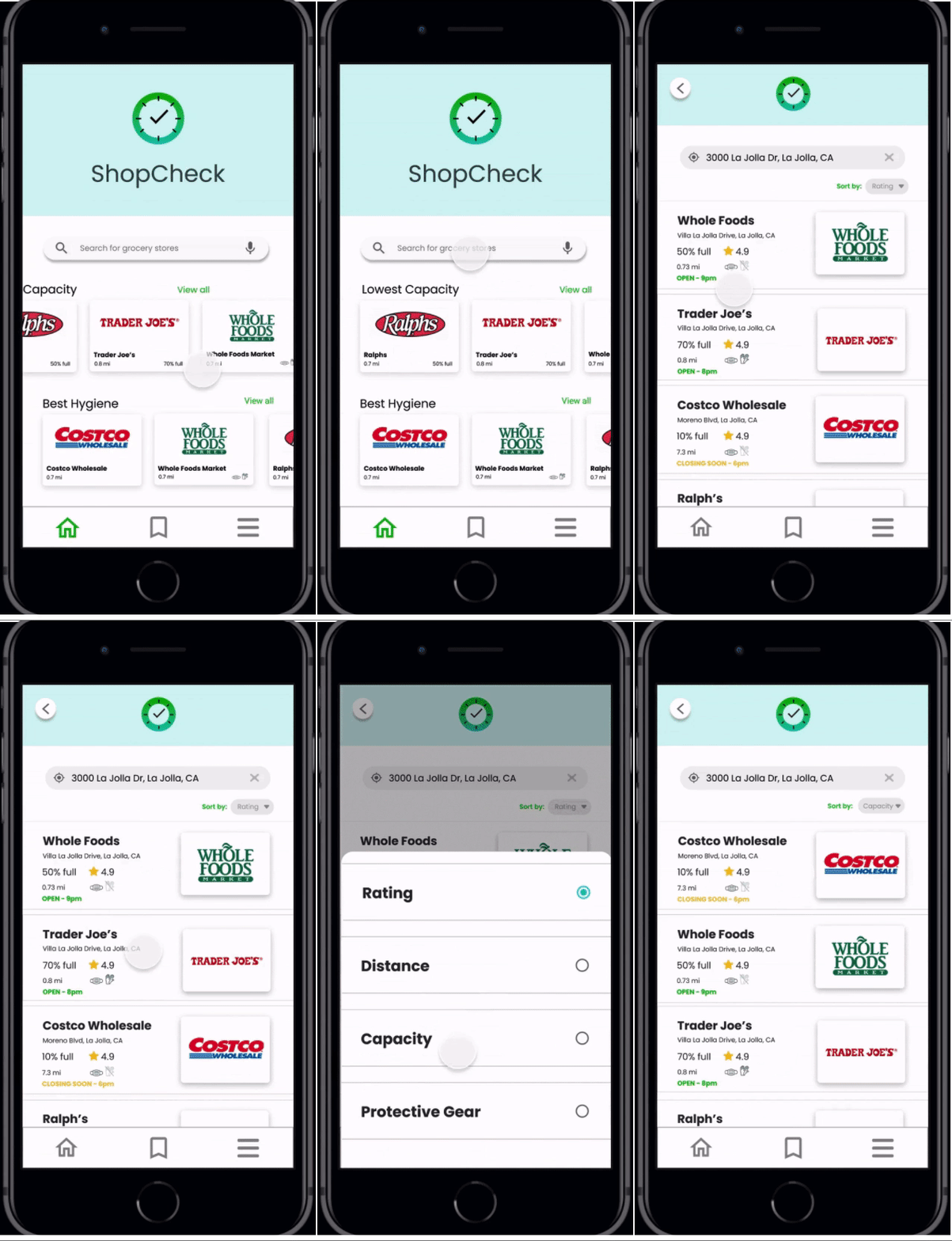
Homepage shows a list of grocery stores. The bottom nav bar is fixed and structures our app.
Current capacity of grocery stores in form of a bar graph to increase discoverability


List of grocery stores based on saved preferences. PPE is displayed if available.
Before completely checking in to a grocery store, users can see a list of safety tips to follow.
We spent a lot of time fleshing out how users would navigate our app. This is a quick glance of what the lo-fi prototypes looked like:

Categorizing fixed navigation bar for better accessibility:
The user experience was centered around a bottom navbar with 3 main pages.

Inspired by the simplicity of the Yelp app, this page allows users to view suggested grocery stores and search for specific destinations.
Having a list of saved locations can help users access frequented grocery stores quickly.
Allows users to access their profile, see a list of current or previous check-in’s, adjust various settings, and send feedback to us.

Two-sided benefits with Check-In system:
Checking-in allows customers to skip the line or wait in a priority line when arriving at the grocery store. Simultaneously, employees may see the amount of customers that check-in to better manage the flow of customers to increase safe shopping.
PIVOT
ADDING a Reward system
To encourage users to check-in for their own safety and of others, I suggested a coupon reward system that can be used during check-out.
Customers can check-in to gain “fast-pass”
access to the store in addition to receiving a
coupon if they choose to check-in at a store
that is not busy.
Employees can better maintain safety
standards.


User flow to checking-in with a coupon:


USER TESTING
Defining tasks
We gave 5 users a task-based scenario where the goal was to have them intuitively and easily navigate through the app and find the best way to safely find stores to shop in in order to get a priority line. This list is a quick'n dirty technique for users to complete an intended journey.
-
Find the nearest stores near you
-
Filter by capacity
-
Save a store that offers protective gears
-
Check-in a store that is not busy
-
Understand what the QR Code is for
-
Go to Home
-
Find your check-in
-
Cancel your check-in
Based on task results, we resolved some of the unclarities:
Before
After


2/5 users couldn't see more details of the grocery store we
Added more information regarding store
Before
After


3/5 users misinterpreted the graph, mixing up average capacity during each hour of the day with current one.
Reordered bar graphs and used colors to indicate traffic
Suggestions and considerations from users:
Be more helpful
Be more personal
Refine the check-in system
-
Add “Sort by Recommended” (Best Rating + Lowest Capacity + Grocery Stores)
-
Allow users to rate the store within the app
-
Suggest a recommended best shopping time for each location
-
Add a new feature where users can see how much stock of each item is left.
-
Allow stores to limit the amount of check-ins per time interval
-
Recommend stores that have a check-in option but are at low capacity
DESIGN SYSTEM
styleguide Choices


HI-FI DESIGN
Consistent colors and icons for branding

APP FEATURES
BUT FIRST, SAFETY!


Open the app to reveal 3-step tutorial
Quick Guide for First-Time Users


Safety Reminders & Notifications:

Sort by rating, distance, capacity, or protective gear
Filter Stores by Capacity:

Find Nearby Locations:


To ensure further safety for customers, we added a pop-up right before finalizing check-in and after.
Added sanitation tips pop-up:
Prevent external exposures as much as possible

Coupon Incentive:
Check-in a store that is "not busy" to claim a coupon.

QR Code:
Employee can confirm that you've checked-in and lead you to priority line.

Fixed Nav Bar (3 Icons)
Easy Navigation:
Saved Locations:
Quick navigation to check into stores that are saved

See current or see past check-in's
See All Check-in's:
We are always looking to improve users' experience.
Send Us Feedback:
Conversion Rates
Engagement
Task Success Rate
-
Percentage of users that check-in successfully and have QR Code scanned.
-
Average time users spend on each screen
-
Percentage of users that succesfully completed tasks
MEASURE
kpi's for success
Defining metrics (KPIs) to measure success is essential to receiving validation from users and confirming initial hypotheses about the problem space.
Marketing campaign

REFLECTION
WHat did i learn?
Learn to give and take feedback
Choosing words carefully to make sure that you are critiquing someone's work and not criticizing shows that you have a level of mutual respect. I'm still trying to master this skill of engaging in meaningful yet constructive discussions with teammates and other members.
Challenge of online meetings
Being in different parts of the world created more communication frictions but we were able to strategize a good schedule for everyone to meet up 3 times a week. Moreover, switching from in-person interview format to online format created more opportunities to find a wide range of workers of different backgrounds, but at the same time, resulted in more technical difficulties, especially for those that are not that tech savvy.
Improved iconography
Modern UI visual elements is an important aspect of designing that allows users to trust the app. Because our generation has never encountered a pandemic to this scale, I didn't have any past references to projects that were created to ensure people's safety. Therefore, creating icons that are not necessarily universal but can still convey to the users the meanings that designers intend to has been a challenge yet refreshing to see.

Changed all mentions of “PPE” into icons
of masks, gloves, and hand sanitizers
to
reduce cognitive load
ACKNOWLEDGMENT
